How Door Signage Helps Keep Your Home Organized Without Looking Like an Office

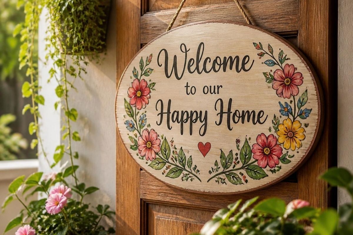
Home door signage refers to small, wall-mounted or door-mounted signs used to label rooms in a residential space, helping household members, guests, and visitors identify rooms without the institutional look of commercial signage.
There's a version of home organization that involves labeling everything: drawers, shelves, pantry jars. It works beautifully for kitchens and storage. But when it comes to doors, most of us stop short. We organize every drawer but leave our rooms unnamed, even in homes where a first-time visitor genuinely has no idea which door leads to the bathroom and which opens into a linen cupboard.
The reason most people hesitate is the association with offices and commercial buildings. Nobody wants their hallway to feel like a hospital corridor. But residential door signage has come a long way from plastic plaques with block lettering. Done well, it adds clarity to a home without sacrificing warmth.
The trick is to think of signage as part of the interior rather than as something added afterward. A small plaque can function much like a picture frame, light switch, or piece of hardware: useful first, but also capable of contributing to the overall character of the room.
When Labelling Rooms Actually Helps
Not every home needs labeled doors. But once a living space has multiple bedrooms, a separate office, and a few utility areas, simple identification starts to make a practical difference.
A few scenarios where it works well:
Larger homes with multiple bedrooms. When bedrooms look similar from the hallway, a small sign helps overnight guests find their room without opening every door.
Homes used for short-term rental. Clear room labels help guests orient themselves independently. Some hosts find that this can support a smoother guest experience, particularly in properties with multiple floors or unusual layouts.
Houses with dedicated workspaces. A labeled home office creates a gentle visual boundary between work and personal space, something many remote workers appreciate.
Multi-generational homes. When grandparents, visitors, or carers are navigating an unfamiliar layout, discreet room labels reduce confusion without requiring anyone to ask for directions.
There are also smaller situations where signage can be useful. A utility room, laundry area, storage room, or pantry may look almost identical to another door in a busy hallway. Labeling these spaces can prevent guests from accidentally wandering into areas that are not intended for visitors.
The same principle applies when a home has been converted, extended, or remodeled over time. A hallway that once had two doors might now have five, with rooms serving completely different purposes. A small sign can provide context without requiring a major change to the architecture.
.jpg)
Choosing a Style That Belongs in a Home
The key to door signage that feels residential rather than commercial is choosing materials that match the rest of your interior, just as you would with cabinet hardware or light fittings.
Natural wood signs suit homes with earthy tones, timber floors, or a rural aesthetic. They feel handcrafted rather than mass-produced. Matte acrylic in dark tones works for modern interiors where clean lines and minimal ornamentation are the priority. Stainless steel adds a polished feel that pairs well with contemporary kitchens, bathrooms, and entrance halls. Mixed-material options, such as wood with an acrylic or metal overlay, add a layered quality that works in spaces where textures are already being mixed intentionally.
Color is another easy way to keep signage connected to the room. A sign does not necessarily need to match the door exactly. Instead, look for a color that appears elsewhere in the hallway, such as the tone of the flooring, trim, handles, artwork, or lighting fixtures. This makes the sign feel like part of an existing palette rather than a separate object.
Scale matters, too. A sign that is too large can dominate a narrow door, while one that is too small may become difficult to read. In most homes, subtlety is useful. The sign should be noticeable when someone is looking for information but should not be the first thing they see when entering the hallway.
The typeface on the sign matters as much as the material. A simple sans-serif font keeps things current. A softer, rounded typeface suits children's rooms. And for anyone who feels strongly about typography (you know who you are), custom-engraved lettering offers the most control.
Where Should the Sign Go?
Placement can make a surprisingly large difference. The most obvious position is directly on the door, but that is not always the best choice. If the door has decorative panels, glass, or prominent hardware, placing a sign beside the frame may create a cleaner appearance.
For a hallway with several doors close together, consistency is more important than finding a unique position for every room. Keep the signs at roughly the same height and use the same spacing from each door. Even different room names will then read as one intentional system.
Think about visibility from the hallway, too. A sign hidden behind an open door is not particularly useful. Before installing anything permanently, hold a temporary version in place and view it from the points where someone would normally approach the room.
.jpg)
Installation and Practical Notes
Most residential door signs attach with adhesive backing or small standoff mounts. There is no drilling required in most cases, and the installation takes a few minutes per door. For renters, adhesive mounting is especially practical because it can be removed without damaging the wall when you move out.
A few things worth checking before you order. Measure the available space beside or on the door to make sure the sign fits without crowding existing hardware. Consider the wall color and door finish: a dark sign on a dark wall will disappear, and a glossy sign under a spotlight may produce glare. If you are labeling rooms with text rather than numbers, keep the wording short and readable from a normal standing distance.
Consider cleaning and durability as well. Hallway signs can collect dust just like frames, switches, and other wall-mounted details. A smooth surface may be easier to wipe down than a heavily textured one, particularly near kitchens, bathrooms, and entryways.
If the home has children or older residents, think about readability as part of the design rather than treating it as an afterthought. Clear lettering, sufficient contrast, and a sensible mounting height can make the signs useful to more people without making them look overly functional.
The Result
Well-chosen room signs help a home feel more organized and more intentional without introducing a corporate or institutional atmosphere. They are useful for the people who live there, helpful for guests, and barely noticeable once installed, which is precisely the point. A home that reads as thoughtfully arranged down to its smallest details tends to feel more comfortable for everyone moving through it.
The best residential signage does not announce itself. Instead, it quietly answers a question when someone needs the answer: Where is the bathroom? Which room is the office? Where should I put these towels? That small amount of information can make an unfamiliar home easier to navigate while allowing the overall interior design to remain the focus.
For homeowners who already enjoy organizing their spaces, door signage can also be a natural extension of that approach. It brings the same sense of order used inside cabinets and drawers into the visible areas of the home, but without requiring every surface to be labeled.
Ultimately, the goal is not to make every room look like it has been catalogued. It is to introduce just enough information to make the home easier to understand. When the materials, typography, size, and placement are chosen with the rest of the interior in mind, a small door sign can feel less like a label and more like another considered detail of the home.


.svg)